Link copied to clipboard

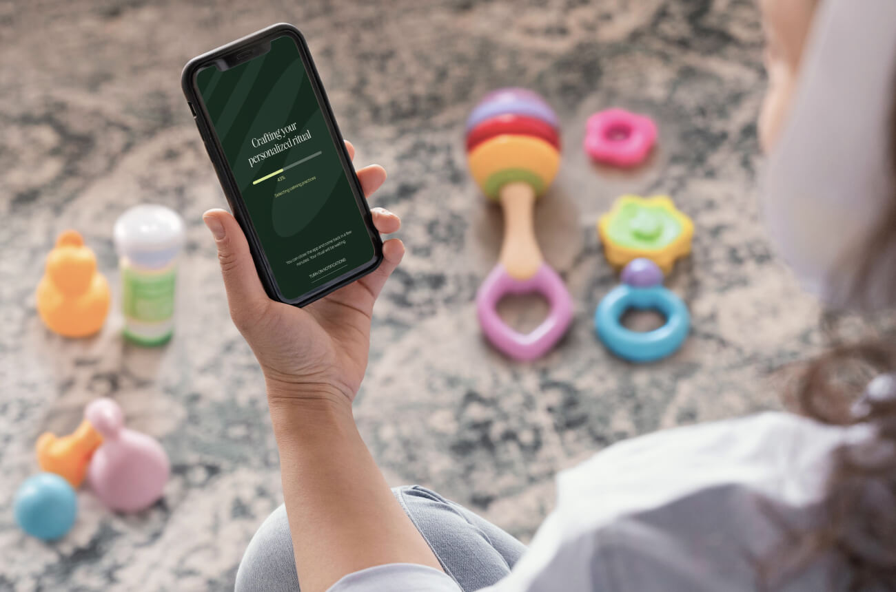
A mom sets up a telehealth account for her kids while her toddler pulls books off the shelf. She gets through three fields before she has to stop.
When she comes back 20 minutes later, everything's gone. She has to start over.
She doesn't. And your product team wonders why conversion is so low.
The product wasn't designed for her reality.
Parents get interrupted constantly. So do caregivers, people managing multiple responsibilities, anyone juggling real life. Yet most interfaces assume you have unbroken focus.
The average parent gets interrupted every 3 minutes. Knowledge workers fare only slightly better at every 3-5 minutes. But we continue to design products as if users will sit down, complete a task from start to finish, and never look away.
This disconnect between how we design and how people actually use our products creates massive problems:
Products that succeed with busy, distracted users share common characteristics. They're not just easy to use—they're easy to come back to. Here's how to design for that reality:
When someone closes your app mid-task because life happened, they should find exactly where they left off. No "Are you sure?" dialogs. No lost progress. No starting over.
Auto-save isn't enough. You need intelligent state management that preserves:
And with forms, always show them it's saved. That little "Saved" indicator builds trust. Users need to see confirmation that their work won't disappear.
When users return after an interruption, show exactly where they were and what's next. They shouldn't have to remember anything. Your interface should remember for them.
This means:
Think of it like leaving breadcrumbs. But instead of users following them back, you pick them up and place them exactly where they need to be.
Status, next steps, progress: easy to see at a glance in under 3 seconds. That's often all the time they have before the next interruption hits.
Important information shouldn't require careful reading or mental processing. Design for scanning:
Remember: your users are reading while simultaneously preventing a toddler from eating crayons, or checking between meetings, or managing three other tasks. Design accordingly.
Stop testing in quiet rooms with participants who have nothing else to do. That's not how your product gets used.
Instead:
You'll discover issues you'd never find in a lab. You'll see how users actually navigate interruptions, what they forget, what frustrates them, and what helps them recover.
Why does all this matter beyond just usability?
Because trust is built through reliability. When your product respects users' real-life constraints—when it saves their work, remembers their context, and makes it easy to pick up where they left off—you demonstrate that you understand their lives.
For products targeting women and families especially, this understanding is crucial. These users are managing complex, interrupted lives. They don't have time for products that waste their effort or make them start over.
Products that work for busy, interrupted users aren't just easy to use. They're easy to come back to.
That's what builds trust.
Start small. You don't need to redesign your entire product overnight. Pick one area where users frequently abandon tasks:
Then apply these principles systematically. Add auto-save. Improve state management. Make re-entry clearer. Test with real interruptions.
Measure the impact on completion rates and user retention. You'll likely see significant improvements.
Designing for interrupted users isn't designing for edge cases. It's designing for reality.
The mom setting up that telehealth account? She represents millions of users trying to accomplish something while life happens around them. The question is: will your product help her succeed, or will it force her to start over?
The products that win are the ones that work with users' reality instead of against it.

.jpg)
