Link copied to clipboard

For the past few months, I've been tracking something: Which design projects feel effortless? Which ones drain me? Where do I bring something unique vs. just "good design"?
So I did something kind of nerdy - I looked back at the projects I've worked on since I opened my business. I started writing down what I liked and what I didn't. What went smoothly and what didn't. Where I brought real results and where I was just... good.
And I started seeing some patterns.
One pattern stood out more than the others: the projects where I did my best work were all products for families and women.
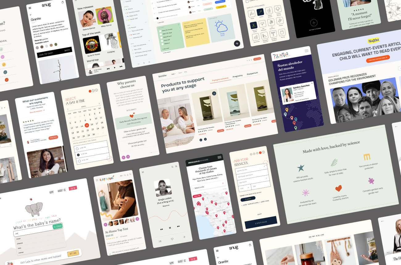
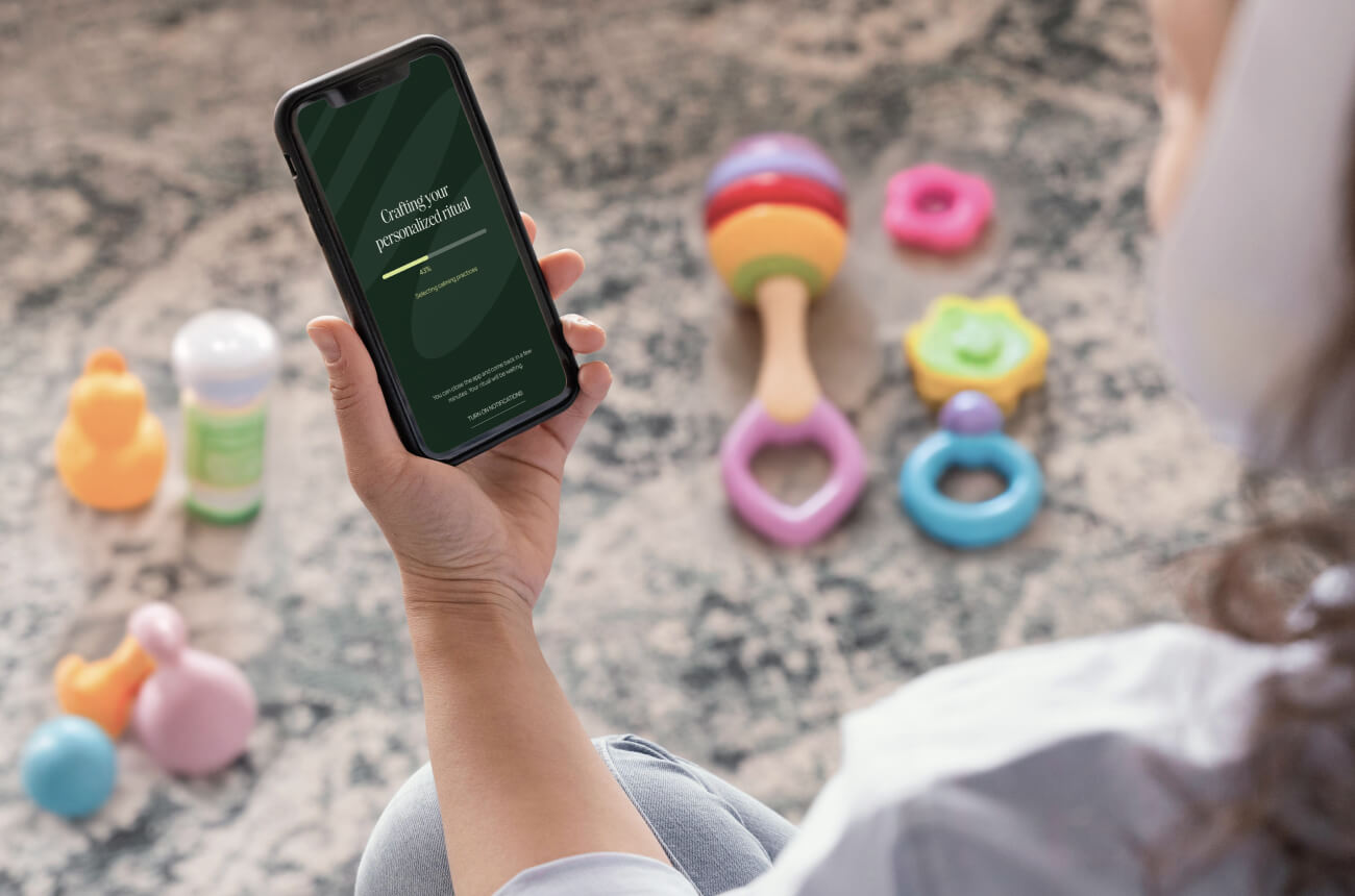
Not "femtech" in the narrow healthcare sense - but products designed for people who identify as women or share women's lived experiences. Health apps, yes. But also parenting tools, household management products, education platforms, convenience apps for busy families.
I kept asking myself: why does this work feel so different?
And then it hit me.
I'm not just the designer. I'm also the user.
There's something uniquely powerful about occupying both roles simultaneously - designer/researcher AND user.
When I'm designing a family scheduling app, I don't have to imagine the mental load of coordinating multiple people's calendars. I'm living it. When I'm working on a health product for moms, I don't have to conduct extensive research to understand the trust barriers. I feel them every time I consider sharing my data.
This isn't to say user research isn't important. It absolutely is. But there's a different quality to the work when your instincts are informed by lived experience. The questions you ask are sharper. The solutions you propose are more nuanced. The edge cases you anticipate are the ones you've actually encountered.
What's amazing is that in this process, I became more and more aware that becoming a mom has helped me say no to work that doesn't feel 100% aligned.
It's not just about having less time (though that's certainly true). It's about having more clarity on where my time creates the most value.
I can take on projects in unfamiliar spaces - I've been doing that successfully for 20 years. But now I'm asking myself: where do I bring something beyond solid design skills? Where does my perspective add a dimension that another designer couldn't easily replicate?
And the answer keeps pointing to the same place: products for families and women.
My lived experience as a mom, as a woman navigating digital products while juggling multiple responsibilities, as someone who feels the weight of privacy decisions for my family - that's not just helpful context. It's my competitive advantage in this specific space.
I'm in the process of re-niching. I don't have all the answers yet - I'm still connecting and disconnecting dots.
I'm testing this focus for the next few months before making any major changes. I'm taking courses in HIPAA compliance, accessibility, and inclusive design to strengthen my expertise in this space. I'm being selective about which projects I say yes to.
I think something really interesting is coming.
And I can't wait to take you with me on this journey.


.jpg)