Link copied to clipboard
Most brand guides are beautiful portfolios. Here's how I built one that the marketing team could actually use in Canva, at 4pm on a Friday.
When The Juice came to me, they had a problem I see constantly with post-MVP startups: their visual identity couldn't keep up with their growth.
The Juice is a news platform for tweens and teens, delivering daily news in language that actually resonates with young people. But their business was complex: schools and libraries purchased subscriptions, parents could buy directly through a newly launched D2C offering, and students were the actual users.
Three different audiences. Three different lenses on the same product. And a visual identity that couldn't speak consistently to any of them.
They had a logo. They even had a brand guide, a beautiful one, clearly designed by someone who knew their craft.
But here's what was actually happening. There was no source of truth. Marketing assets looked different depending on who created them that day. The brand guide was gorgeous to look at, but it functioned more like a portfolio showcase than an instruction manual. And the team, who had no dedicated marketing or brand designer, needed to create materials in Canva but had no clear system to follow.
Here's what inconsistency actually costs you: When your brand looks different across touchpoints, parents question if you're legitimate. Schools see risk. Students smell inauthenticity from a mile away.
For a product targeting children, you don't get a second chance to look credible.
The real test wasn't whether designers would admire it. It was whether someone could use it confidently in Canva without asking for help.
Before touching a single pixel, I mapped the real-world constraints. Most marketing assets would be created in Canva, not Figma. The team had no dedicated marketing or brand designer and needed to self-serve. Assets needed to work across three audiences: schools, parents, and students. The system had to scale from social posts to UI to pitch decks. And it had to be easy to implement across all platforms, including the product itself.
These constraints weren't limitations. They were design requirements.
One of the biggest changes I made was reducing the color palette.
The original materials used a wide, vibrant range of colors, including neons that were energetic and youthful, but chaotic and difficult to work with in practice. Non-designers didn't know which colors to use when, how to combine them, or what the hierarchy should be. The neons especially created problems: they were hard to pair with other colors and nearly impossible to make look polished without a designer's eye.
Instead, I created a limited, intentional palette with clear roles: primary colors for brand recognition and CTAs, secondary colors for accents and categories, and neutrals for readability and backgrounds.
But more importantly, I defined hierarchy rules, not just color swatches. When to use each color. How much of each color in a design. What combinations work together. And I showed wrong examples alongside right ones, which is huge for non-designers.
The result was a palette that was still vibrant and youth-friendly, but structured enough for confident execution by people without design training.
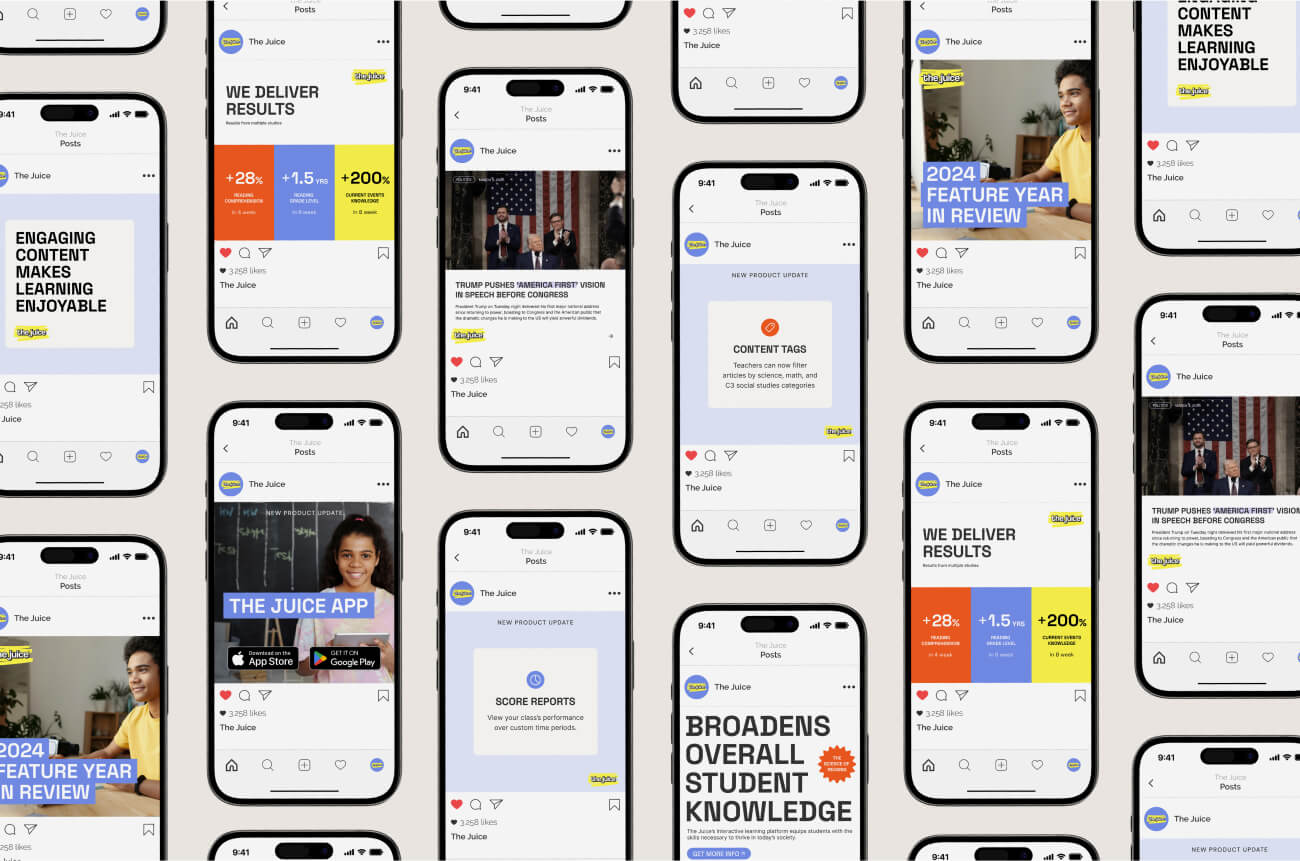
Instead of a traditional brand book with inspiration boards and abstract principles, I built a library of working templates.
Social media templates pre-built in Canva and ready to customize. Email headers with multiple layouts for different audiences. Marketing assets like one-pagers, infographics, and event graphics. UI component examples showing how the brand translates to the product. And an image treatment system with customized stock photos that included overlays and filters as reusable assets.
The brand guide I delivered wasn't aspirational. It was instructional.
I included detailed explanations of how to use the brand: when to use which logo variation, how to work with the color palette, the hierarchy of colors and typography, and how to implement designs across different assets.
I also provided real examples, showing how to use images properly with the customized stock photos I created for them. The goal was to make it easy for anyone on the team to grab what they needed and apply it, whether they were working in Canva or designing UI elements.
While I don't have quantitative performance data yet (this is a recent implementation), here's what the system delivered.
The brand is now consistent across all channels. The marketing team can create assets faster because they self-serve in Canva. There's clear visual hierarchy between B2B and D2C materials. The system scales as the company grows. And the internal team has confidence to execute on the brand.
Most importantly, the system is actually being used. Not sitting in a folder labeled "Brand Guidelines Final v7." Not requiring a designer for every social post. Being used.
If you're building a product for families or multiple audiences, your visual identity does heavy lifting beyond aesthetics. It signals credibility, professionalism, and readiness.
Design systems must account for who will actually use them. If non-designers can't execute your system, it will fail.
Constraints are features, not bugs. "Must work in Canva" wasn't a limitation. It was clarity.
Show, don't just tell. Wrong examples are as valuable as right examples.
Reduce to scale. A smaller, intentional color palette creates more consistency than a large "flexible" one.
Cohesion signals readiness. Every inconsistent touchpoint makes people question if you're ready for their business.
.jpg)

